Clinical Informatics Product Marketing
Apelon is a clinical informatics company focused on accelerating eHealth through data standardization and interoperability. For over twenty years Apelon has collaborated with many of the world’s leading public and private healthcare organizations to design, build, and deploy clinical terminologies.
Problem Space & Opportunity
Problem:
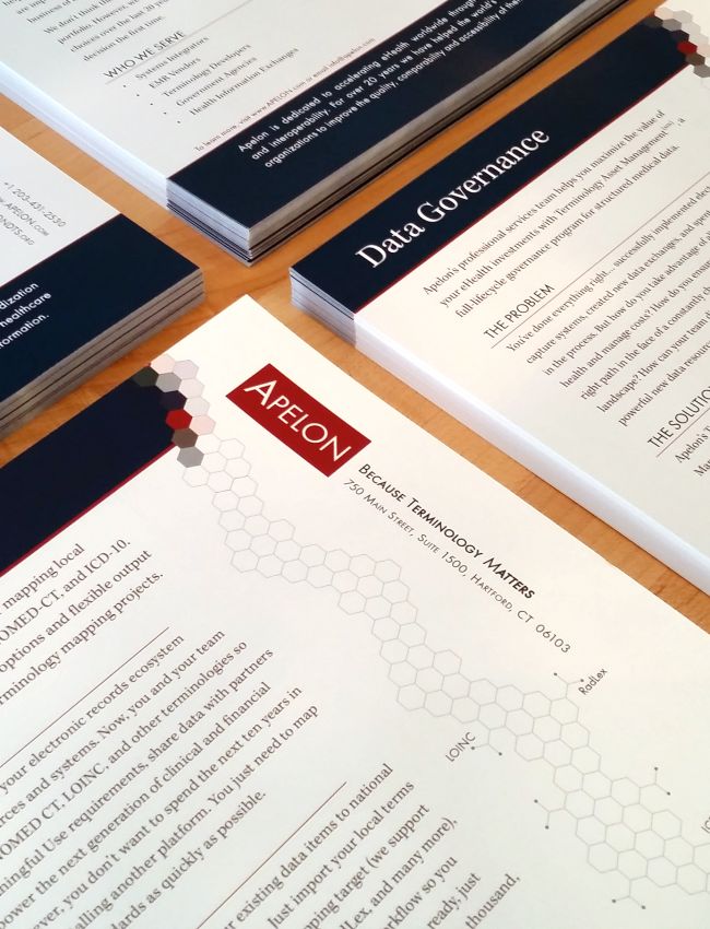
Apelon approached me with a desire to overhaul their brand, content strategy and marketing materials. Their legacy site and materials had been written by developers and they wanted to make their message more accessible to key decision makers within Health Care organizations and Software Development firms, many of which did not possess technical acumen.
Opportunity:
Transforming the brand and content strategy for Apelon's health care interoperability and data standardization software products & services will expand the funnel for their product and increase sales and revenue by targeting decision-making personas across numerous organization types including government agencies, EMR vendors, and health information exchanges.
Hypothesis:
Identify the key personas and organization types that would benefit from purchasing services and/or products from Apelon. Craft a SEO information design, content strategy, and marketing funnel to drive accurate, traceable sales opportunities. Update the brand to reflect the value of Apelon's products & services and launch an omnichannel marketing campaign with website to social media automated postings to raise awareness and land new clients.
The Goal:
Integrations with Saleforce's CRM and Mailchimp serve as the foundation for collecting and following up with leads. Apelon's website also serves as a platform for blogging about events, news, and relevant content. Posts are automatically published throughout key landing pages on the website and their social media platforms.
Techniques
-
Brand Redesign
-
Persona Development
-
SEO, Information Design, Content Strategy
-
Responsive UI and CMS Development
-
Salesforce integration
-
Omnichannel Product Marketing
-
Print design
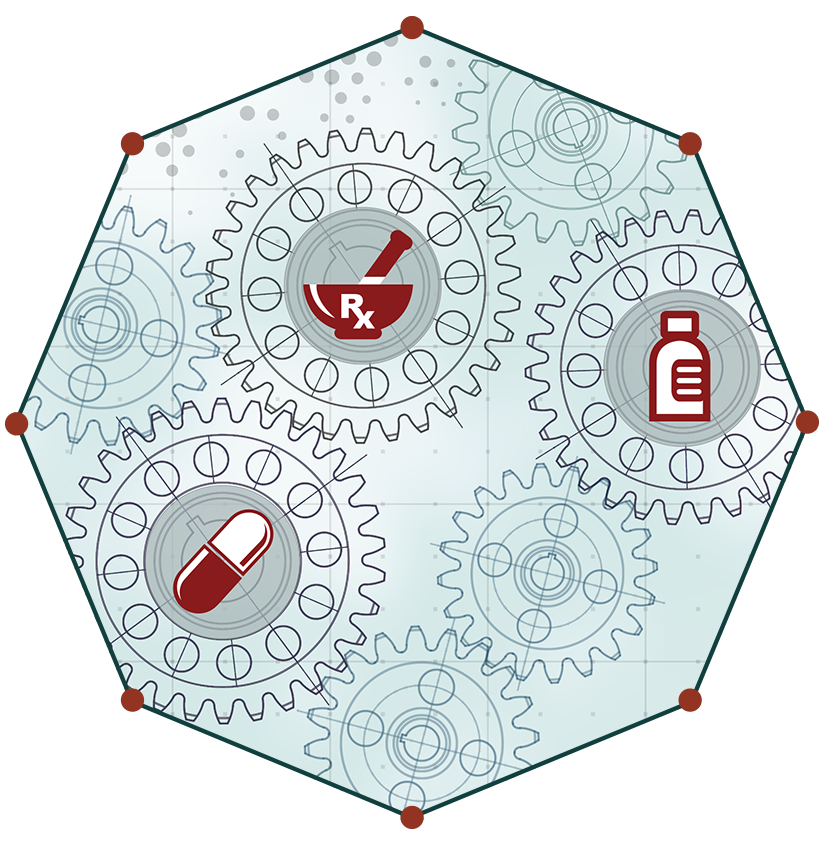
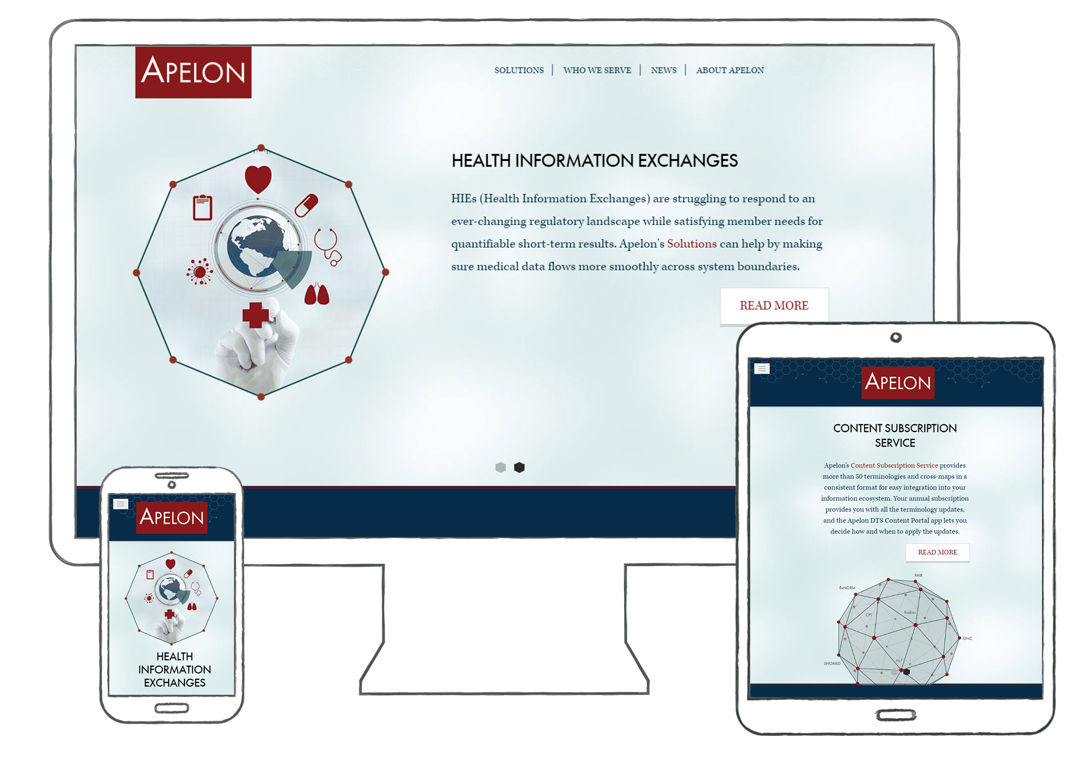
Responsive, mobile friendly design

Insight
My approach to the site build
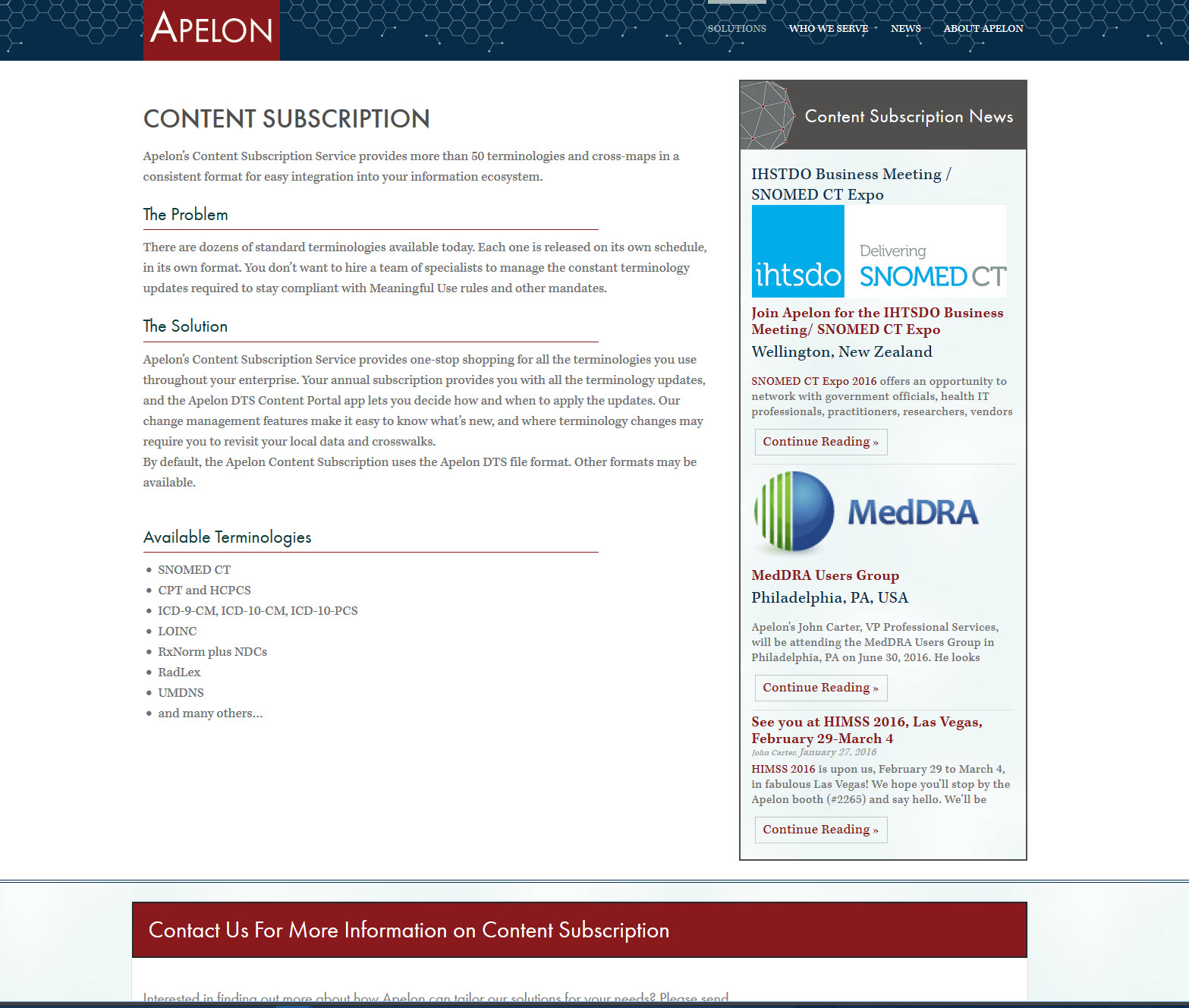
This project was a ground up overhaul that included everything from marketing materials to a website build. For the site, I did extensive keyword research and competitive analysis to determine an information architecture that was accessible for a variety of users. This segmented Apelon's content across "Who We Serve" and "Solutions", ensuring that a user at any technical level will be able to find information relevant to their search.
View Site: Apelon

Interface
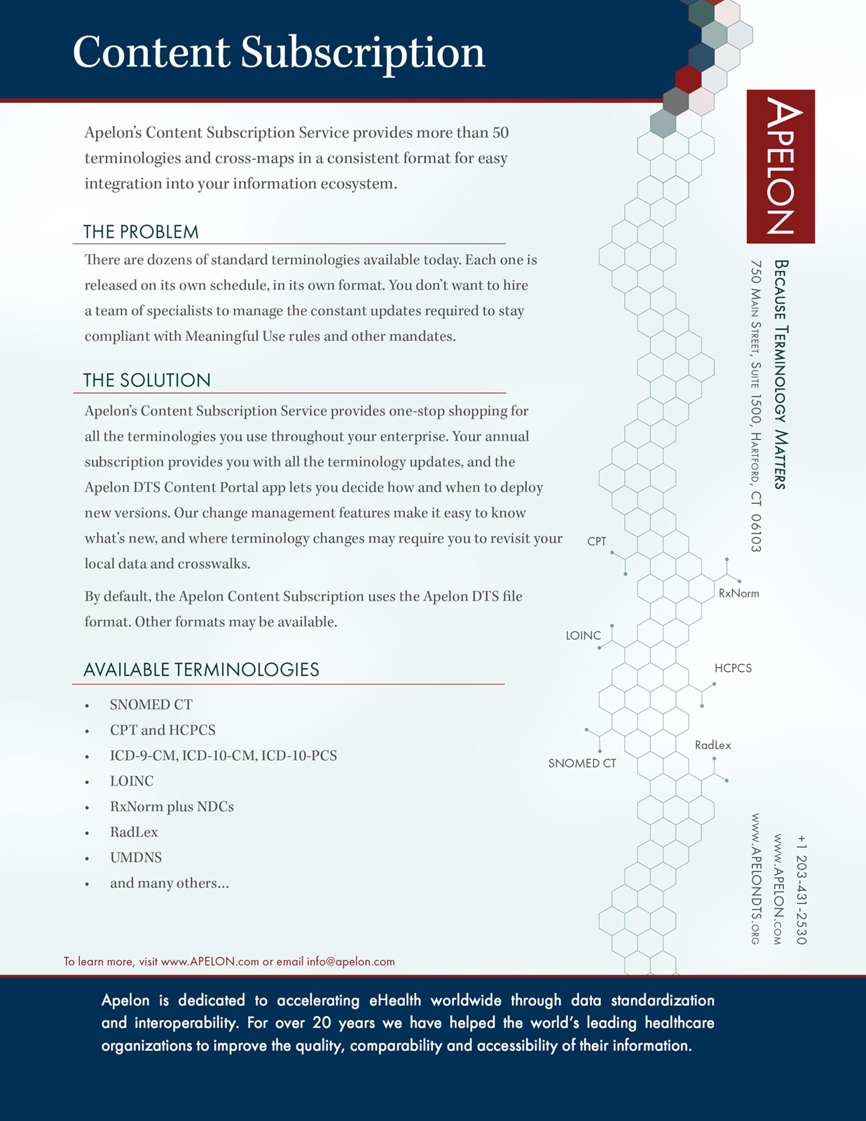
Every lead is captured through forms that are placed within each section of the website. Leads are then automatically imported into Salesforce for follow up. Each field is mapped into Salesforce to ensure a comprehensive transference of information. Finally, the user is emailed correspondence that includes a "tear sheet" they can share with team members or management.

Influence
Social media integration
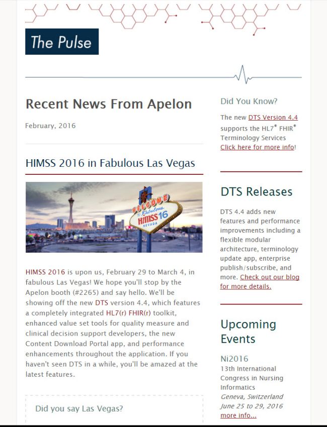
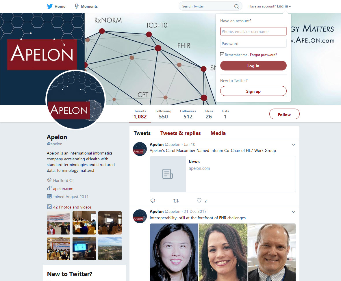
Once the design assets were complete, I applied the design to Apelon's LinkedIn, Twitter and Facebook pages. Each blog entry was automatically pushed to Hootsuite where schedules pushed content live on key dates and times.
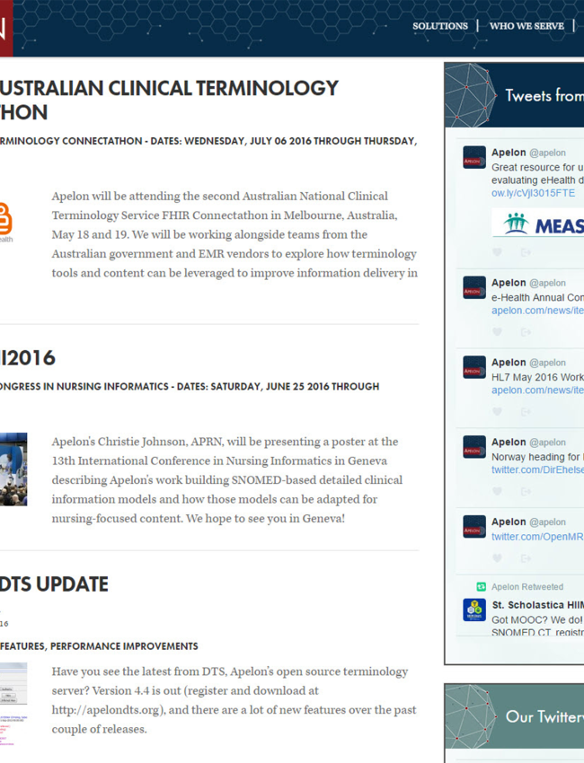
Within the website, block feeds were added to each page. These feeds featured blog entries tagged with the respective page's subject matter. This imparted a dynamic, real-time urgency that conveyed that Apelon is active and relevant.
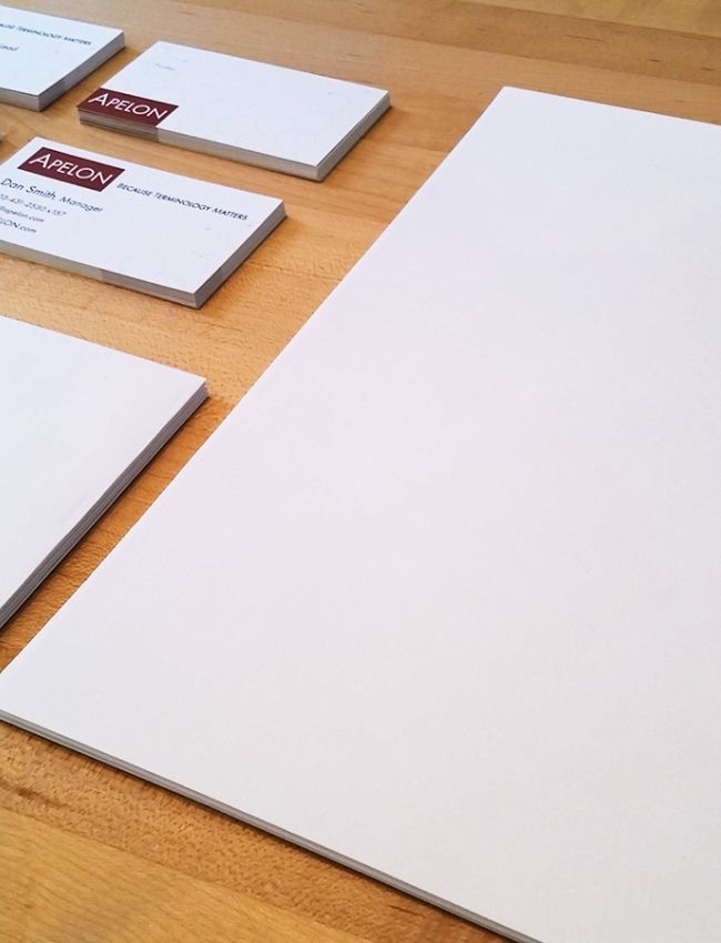
HIMSS is a global, cause-based organization focused on better health through information technology. Each year medical tech companies from around the world exhibit at HIMSS to optimize health engagements. I designed all of the assets and worked closely with the printer to create a modern, comfortable and relaxing environment.

