Project overview / Challenge
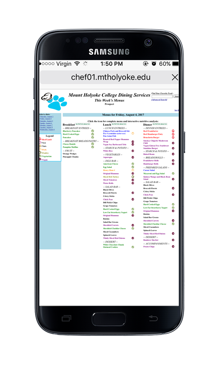
In 2017, I led a team to overhaul the Mount Holyoke College Menu which was, before we started, a tables based web interface tightly woven within .aspx. It closely resembled web applications from the late 1990's. My team produced a fully revised, user friendly digital experience that dramatically improved the selection of a students breakfast, lunch and dinner.
This page presents the arc of a development cycle that integrates user experience design, research and engineering at its core. I'll detail each phase of the cycle and share how we iterated and worked with stakeholders to gain approval. I'll also include specifics on how we used metrics, surveys, and moderated user testing to reach the final product.
My Roles
- Team Lead
- Product Strategy
- User Research
- Wireframe & Prototype
- Design & Iconography
- Feature Enhancement
- Front-end Development (+ team)

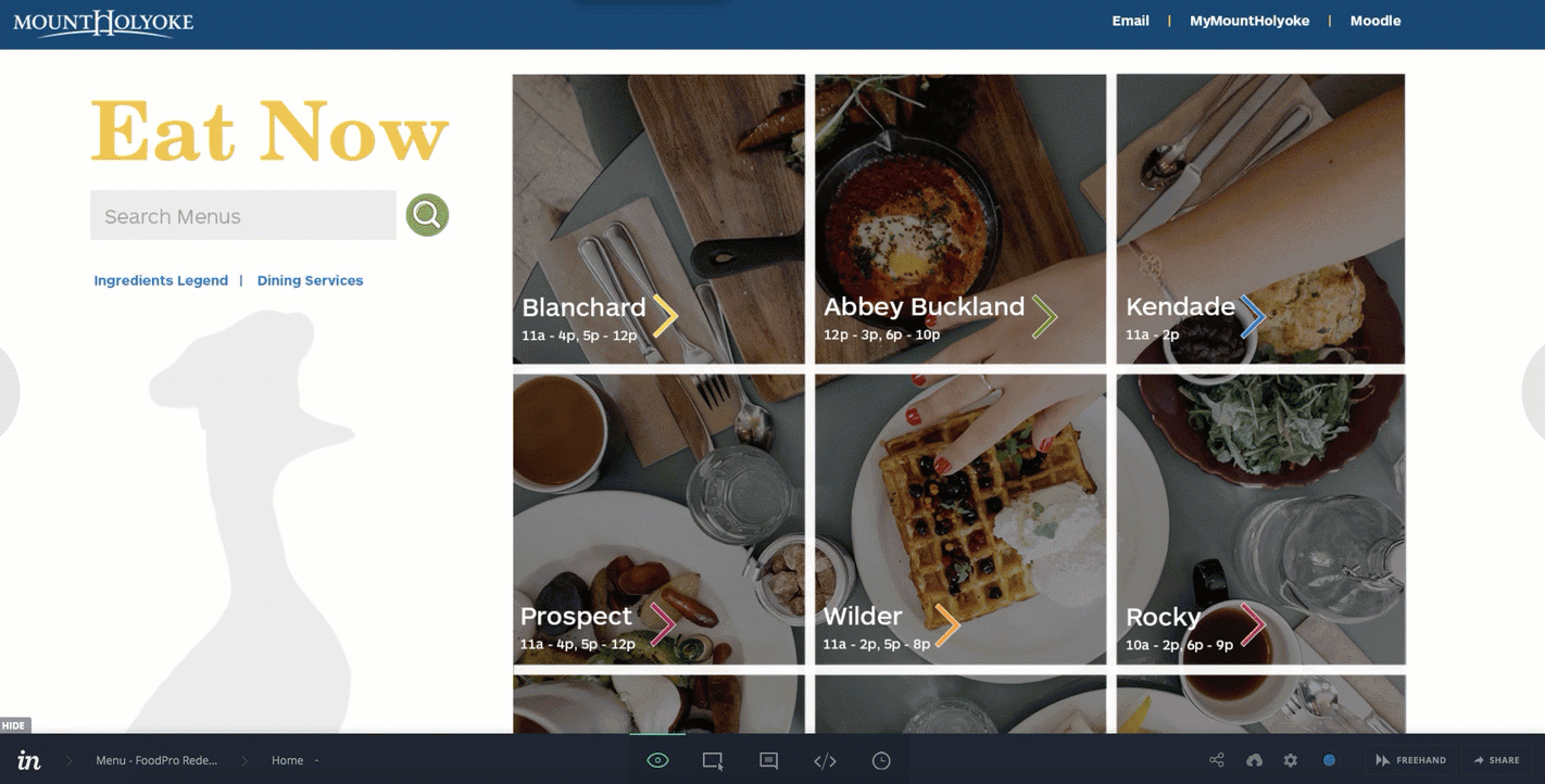
Responsive, mobile friendly design

Before and after (a side-by-side)
Mount Holyoke Menu is built using a proprietary software application that controls food inventory, recipes, and the web presentation of meals for the day. Its importance lies in the fact that students reside on campus; therefore, depend upon this digital experience to make nutritious decisions. After doing an audit of the 133 digital products the college provides, I selected this as our first project.


Defining the Project Ecosystem
Once we completed our heuristic analysis, we prepared a digital slideshow to document the project approach, scope of work and key issues to present. This helped to neatly pitch our project to stakeholders around campus. In this presentation we included:
- Site type to guide the business requirements. For menu, we are working with a content source site which has
- New info daily
- Repeat visitors
- Browse and filter
- The outcome of our heuristic analysis including side by side comparisons of other organizations using the same menu software. This gave them a real example and showed them the possibilities.
- A tiered project model which demonstrated the different project outcomes with multiple approachs. This gave the stakeholders a clear baseline so they could gauge the return for each level investment.
I presented the proposal to key stakeholders from different campus divisions to pitch the benefit of the product upgrade. During the meeting, we received approval to move forward.
Presentation


Personas
- 18-26 (Insight: 100% have a mobile device and are comfortable with a mobile app interface)
- Female / Identify as female (Insight: more concerned with caloric intake and nutrition}
- Live & eat on campus (Insight: dining times are scheduled in tight proximity to class schedules – efficiency is critical)
- Globally Diverse | 61 countries represented, “It feels like a sample population of the world, like little pieces of cities around the globe have migrated onto campus.” (Insight: English may not be their first language – using visual cues would increase instant recognition)
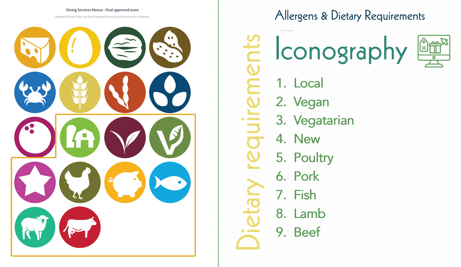
- 50% have allergens or dietary requirements (Insight: meals may be skipped or foods avoided due to a lack of access to ingredients – surface these next to each meal listed)
- 65% already use their phone to access the menu (Insight: regardless of the interface, students are still using their phone because that is their point of access – not a computer).

Prototype
Interaction Design
From our analysis, the main interaction design elements we wanted to improve were:
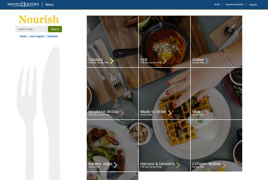
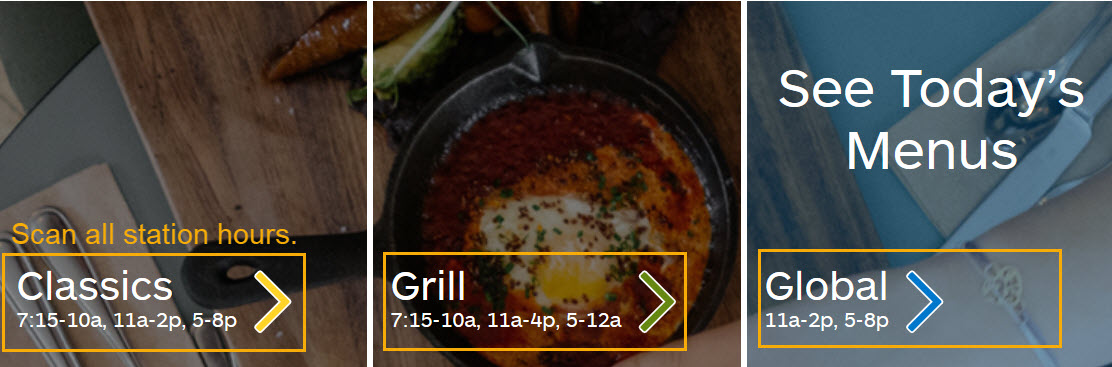
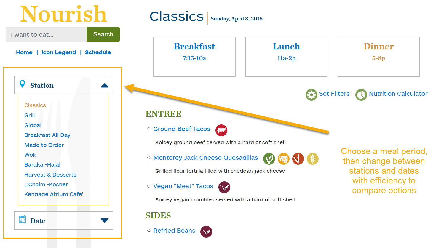
- Display / Placement of Hours: Move hours to the homepage so you don’t have to click through to each station to see when it’s open.
- Update existing iconography: This appeals more quickly to an international audience, creating visuals and removing the language barrier.
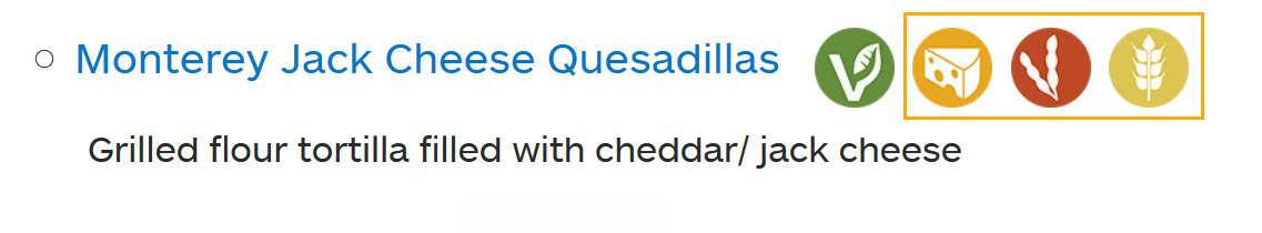
- Surface allergen icons: Allergens could only be found deep within the website architecture, making it hard to find. Furthermore, they had no “icon” unlike Dietary Restrictions.
- Legend: Create an Icon Legend and nametags so the interpretation of the images is discernable in case it’s not clear.
- Add the ability to easily compare options: Give the user the option to change stations and compare meals being served on the same day and meal period. Increases their likelihood of eating – more options. More efficient.
- Reduce Cognitive Load: Separate an entire day into meal periods to reduce the cognitive load of seeing all meals being served on one page (breakfast, lunch and dinner).
- Design an app: Give them an interface that feels like a native phone app when viewed on a phone. It’s more familiar. The purpose of a content site is to support quick and easy decision making by providing information in an easy to digest user interface. In a content site, the presentation and structure is consistent across most pages.
View Site: Menu

Translate design into well-crafted code


Metrics Analysis
User Behaviors and Takeaways
- Increased efficiency (ease of use): Time on page has been reduced by 73%
- Increased explorations (usability): page views increased by 2.6 times
- Higher satisfaction (pleasure): Session duration increased by 6.9 times and bounce rate decreased by 64%

Tasha Tudor and Family
Information architecture
UX design
Visual design
UI development

Jim Wann, Musician
Information architecture
Art direction
Visual design
UI development

Apelon
Content strategy
Visual design
UI development
CRM integration
